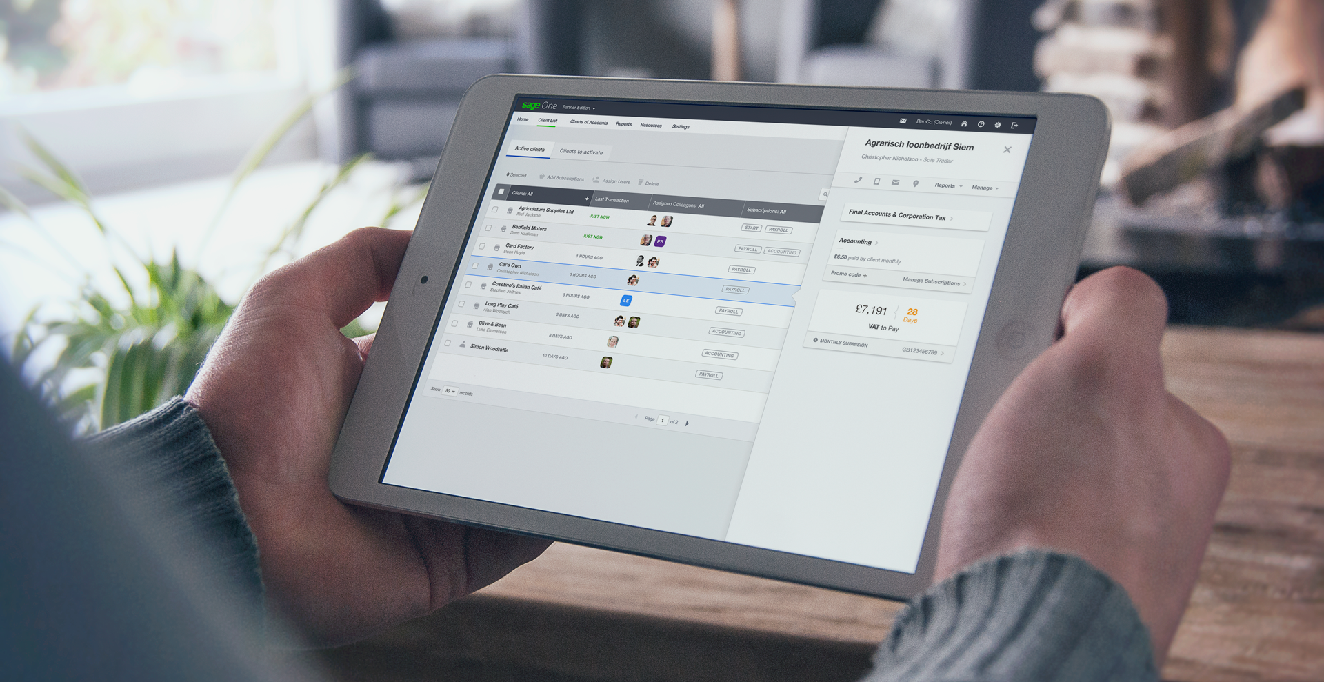
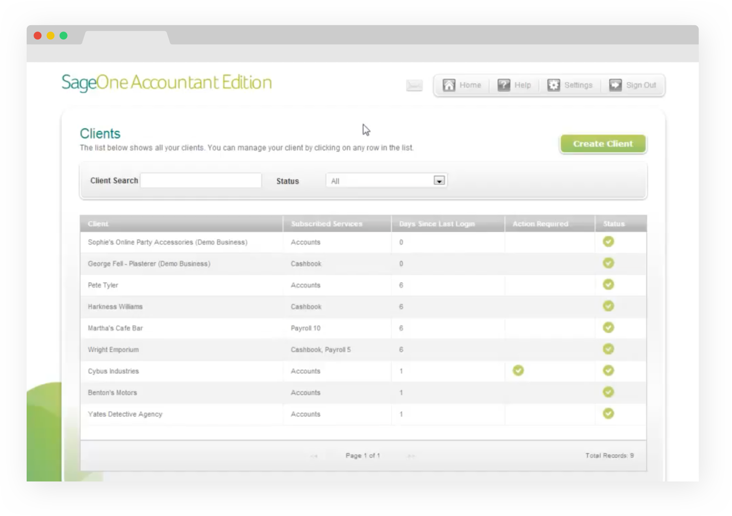
Sage Partner Edition

Research, Visual & Interaction Design

Overview

Partner Edition is a product for Accountants that lets them manage large groups of clients from one central location. I was the Lead Designer on this project, working on the research, interaction and visual design. Throughout, I tapped into the insight of my colleagues and this is a culmination of a large piece of collaboration.

The Challenge

The previous version of partner edition was very dated with its Skeuomorphic visuals and limited features; initially it only allowed users to access different clients and leave notes on them. My task was to see how this product could be built upon and influence the future roadmap, helping to create an app packed full of useful features for Accountants.

Solution Sketching

I started the project by doing some solution sketching with designers from across Sage’s global offices; spending two days exploring ideas together before distilling them down into recurring themes.

Prototyping a Concept

From the initial sketches that we had created, I began mocking up visuals using new and pre-existing components. I then built these into a high-fidelity prototype with the intention of using them for testing and refining down further.

Guerilla Testing

Enlisting the help of another designer, we both Guerrilla tested the prototype at a popular accounting conference. Depending on the interests of participants, we flexed the questions that we asked and noted down any key themes.

After the conference, I further iterated the prototype so that our User Researcher could do some more formative research later. Facilitating some sessions myself, we then gathered feedback and I iterated the designs again until we had our final MVP deliverables.

Full-screen Dialog

Using the final visuals as a schematic, we started to implement the new components in React. The first of which was a new full-screen dialog that significantly reduced the number of clicks for importing large numbers of clients in one go. It was also used for the subscriptions dialog so that users could batch apply subscriptions to the same clients after they had been imported.

Sidebar

Reducing the amount of time spent in Partner Edition was a key theme across our new components and the product owner prioritised features that achieved this accordingly. For example, previously users would have to go to a separate page to get an overview of their client’s status. With the implementation of a new sidebar, users now have just one click before they can see a list of relevant KPIs and reports per client.

In-table Microinteractions

Finally, we introduced new micro interactions within the client table. Users can now add tags for client findability and managers can assign colleagues to look after certain clients.

The Outcome

We released an MVP that introduced some simple but highly sought after patterns that were prioritised by the insight gathered from our research. Consequently, Sage now has a much faster product that feels visually consistent with the rest of our other apps. Partner Edition has now also become more of a client management system rather than just a simple list of subscription links.

The new time-saving components are now beginning to filter into Sage’s other products. As well as this, the prototype that I tested has also influenced the Partner Edition Roadmap, meaning that any features that didn’t make it into the MVP will be built in the coming months. These include alerts, improved notes and client-to-user messaging.

Photo of the Partner Edition MVP